Geovisualizations
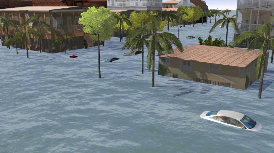
Geovisualizations play a central role in representing scientific information. Effective visualizations of complex spatio-temporal data are essential for communicating scenarios of global climate change, exploring projections of future extreme heat events, or for warning coastal residents about the risks of flooding due to hurricane storm surge.
Our approaches to developing geovisualizations employ methods and techniques from spatial sciences, machine learning, and social sciences. We work with observed and modeled Earth System science data in 2D, 3D and 4D geospatial applications, reducing complexity of multi-dimensional atmospheric data, performing geoprocessing tasks, and creating realistic representations of potential impacts from weather hazards. We integrate quantitative and qualitative data through mixed media (e.g., photos, videos, and narratives in the StoryMaps) and employ user-centered design to develop interactive dashboards to enable decision-making.
The Future of drought - NCAR GIS Program
The animation represents a 3-year running average of the Palmer Drought Severity Index (PDSI) for historical and future RCP 4.5 projections. Shaded regions show areas where cropland is at least 10% of the land area (using static 2015 Crop Data Layer (CDL)). Drier regions are represented with negative PDSI values and colors from red, brown and yellow. Wetter regions are represented by positive PDSI values and colors from green, blue, and magenta. The PDSI data was generated by Aiguo Dai from University at Albany, SUNY.